ShopDreamUp AI ArtDreamUp
Deviation Actions


Suggested Deviants


Suggested Collections


You Might Like…


Featured in Groups


Description
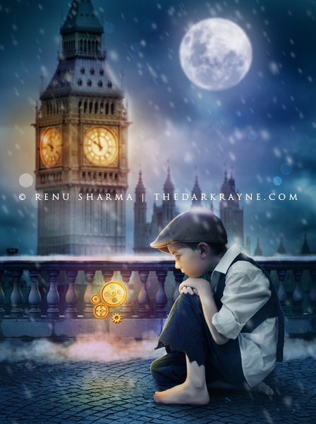
An artwork inspired by the movie Hugo.
Credits:
Boy: *auroradreams
Balcony: ~RiNymph-Stock
Gears: *redheadstock
Big Ben: ~nevertakemystock
Moon: ~Falln-Stock
Other recent artworks:


Credits:
Boy: *auroradreams
Balcony: ~RiNymph-Stock
Gears: *redheadstock
Big Ben: ~nevertakemystock
Moon: ~Falln-Stock
Other recent artworks:
Image size
448x600px 206.28 KB
Comments238
Join the community to add your comment. Already a deviant? Log In
Actually, I'm really trying to find something constructive to say, but it is fairly hard considering that I already said that I love the picture. So, let try!
The texture of the street is kind of small. I don't know how a london bridge's pavement should look, but I guest it is fairly bigger. Anyway, I think that it could be more interesting if you just correct two things : 1) Pavement bigger, as I said 2) Adding some smaller wet stone texture to it. <img src="e.deviantart.net/emoticons/w/w…" width="15" height="15" alt="
I have the same comment for the back... (I'm sorry, English isn't my first language...) Those little columns behind the charaters... You see what I mean? The look too small. They look weak! It would give a very intersting contrast to see this poor little kid beside of some strong looking stony textured achitecture pieces! Lol!
I don't know if the moo really helps. I think it could give an interesting composition if Big Ben was on the right part of the picture and that there was no moon in the sky. I have two reason to say it. First, it would give an interesting echo to the colors of those little wheels. And it would also give a more dynamic composition. (A ascending diagonal) It could also work to take off the clock to only keep the moon. Then, you'll also get a color temperature contrast, wich should be good. Anyway, the left part is kind of useless and only take off the attention of the viewer. Also, because the moon is behind the clock the main source of lighting should also be behind the clock wich cause a little problem... Well, you still could add a rimlight to corect it if you really whant to have the clock and the moon in the picture.
Ok, let's continue! I think the overall picture could be a bit darker except the light sources and the element directly lghted. For example, the little boy would be darker except for the highlight on his face, his forar and his legs...You also could add a rimlight behind him to cut his shape from the backgound. About the light sources, it should alway be the lightest part of your picture. Actually, if I look at the wheels (wich should be a light source), they are sometime darker that you character's lighted face. Same for the moon and for the clock <img src="e.deviantart.net/emoticons/w/w…" width="15" height="15" alt="
Some of the detail of the kids (the face details, the feet, etc.) are a little bit blury. You would get a more realistic result if it wasn't. <img src="e.deviantart.net/emoticons/w/w…" width="15" height="15" alt="
Finally, one last thing. I think you tried to reproduce an athmospheric perspectve by bluring some elements of the background. Actually, they shouldn't have been blured, but unsaturated (more grayish) and colored with the color of your athmospher. Usually, it is a grayish blue! <img src="e.deviantart.net/emoticons/w/w…" width="15" height="15" alt="